
Whaddaya know, this is my 50th post in the (almost) 6 months since this blog has been in existence! Slow, yes, but steady… 😛 I’m gonna use this teeny occasion to thank you visitors and followers for all the support and encouragement you’ve given me in my cozy corner of the blogosphere. I must say that I’m continuously learning from you and every other talented person here, so thank you for that!
This time, I’m posting a lovely photograph that I did quite some post-processing on. Leanne has been hosting her and Laura’s Monochrome Madness series for a while now, and the next post in the series will be a Christmas Special, where submissions are still monochrome, but with a splash of color included. And this is what I submitted, though it’s more Halloweeny than it is Christmassy. 😛
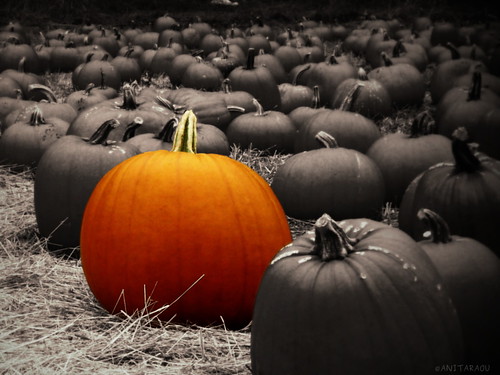
Odd pumpkin out
It did take some effort to get this photograph to a point where I was happy with the result, and I loved working on GIMP for the processing. Though I did a lot of little (and not-so-little) tweaks to finally be able to give this version the nod, I’ll mention the three things that I thought were more challenging than the others, or provided some opportunity for learning. (Or both. 🙂 )
Usually, for a color-splash picture like this, it’s easier if one chooses a picture where the required color is either distinctive in the photograph or concentrated in an easy-to-select area. Here, all the pumpkins are orange, and the one I wanted to select, while still elliptical, is unevenly so. ![]() I isolated the color-pumpkin by additively selecting progressively smaller areas, and did that take time and patience, or what!
I isolated the color-pumpkin by additively selecting progressively smaller areas, and did that take time and patience, or what!
Then there was the matter of the blurriness at the bottom-right outline of the color-pumpkin, because the pumpkin in front is not in focus. A straight-out cut-n-paste of the color-pumpkin makes an unnatural clear-cut edge appear in that area, so I had to add bottom-right sections with different blurs and transparencies to recreate the original blurring and make it look natural.
As I experiment more and more with monochrome, I see on so many occasions that it’s a very different ball game, and I love the unique challenges it poses. So it’s no surprise that a combination of monochrome and color is doubly challenging! 😀 The original photograph showcased the color of the pumpkins, and lighting was not a highlight in it. Well, with monochrome, the pumpkins would actually need some light on them to give them some dimension. With the right settings, the light in the photograph itself sufficed, and the monochrome pumpkins looked fine. But compared to them, the color-pumpkin started looking just so bland (and unnatural. Of course. 😉 ) I then had to add some light effects on the color-pumpkin to make it blend into the scene.
There might be a lot more that I can do to make the picture look better, but I’m satisfied for now with the learnings from this effort. What do you think of the result?

Fantastic!!!
LikeLike
😀 Thank you!
LikeLike
Lovely job on the photo, it turned out quite awesome 🙂 . I just might give GIMP a try.
LikeLike
Thank you, Ruby! I appreciate your visit, your comment and your follow. Yes, try out GIMP sometime. I’ve been using it for a while, but never for a set of effects like this — I say there’s learning opportunities everywhere! 🙂
LikeLiked by 1 person
I should have called you Tolulope, sorry! 🙂
LikeLike
Don’t worry Anita, it’s ok if you call me Ruby. It creates a sense of mystery (That is what I tell myself anyway) 🙂 .
LikeLike
Haha, yeah, I guess the sense of mystery is difficult to refute…
LikeLiked by 1 person
Great work you have done with this photo. Thanks for sharing 🙂 (also to Leanne!)
LikeLike
Thank you, Truels. It was a very interesting edit. Leanne does a lot of work to host MM, I agree.
LikeLike
How did I miss this post !!! A very lovely photo Anita 🙂
LikeLike
Thank you KG! Don’t worry, what matters is that you found it now. 😛
LikeLike