
I’d originally decided to go vintage for this week’s One Four Challenge hosted by Robyn. Vintage, for me, translates to sepia or black and white images, so I decided to shake things up. I thought I’d retain the colors while introducing some damage to the picture. (Now that’d make it not so vintage, wouldn’t it? 😉 )
I first thought of creating something like heat damage, but none of the stuff I tried came out satisfactory. The different dark and light areas cause something that looks good in one region look, well, not so good in another. I was beginning to think that I should abandon my attempts and try something else, but decided to give it a chance when I got this result — a faded, damaged (though not overly) photograph that looks like it used to be a high-contrast one with some over-saturated colors in it…
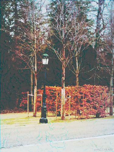
Lamp post, damaged
For this version, I started out by adding a copied layer in Burn mode to get a darker, more saturated version of the image. Then came two vignette layers with 50% opacity, one with black to darken the over-exposed looking ground and sky, and one with blue in Color mode to augment the next layer. And the next layer is the ‘damage’ — a red-on-black lava effect (that one’s available as a render-filter in GIMP), which I added in Grain Extract mode at 60% opacity to make the effect subtle. This layer also lightens the image, which compensates for the earlier darkening from the Burn mode and gives a faded look.
Though it was not what I originally intended, I think it doesn’t look so bad either… What say you?
Earlier images this month in this series

A1!!!
LikeLike
Hehe, thank you!
LikeLike
I think you have got the damaged/ aged feeling down and it looks great. Compared to last weeks picture a different twist. Can’t wait to see what next week brings.
LikeLike
I’m really glad the effect works, Ben! Next week’s one will have to continue with the twists, won’t it? 😉
LikeLike
It certainly gives it a cold frosty feel. I am looking forward to see what you do with it next week.
LikeLike
Thank you, Amanda! I’m happy to see that the cold of that day is showing in this version… 🙂
LikeLiked by 1 person
I love everything about this new version except for how washed out the street gets. The coloring and effect is gorgeous! Really well done. I wonder if there is a way to bring back a bit of color back to the street. Not sure what would look good, really, maybe even cropping it out a bit so it isn’t the whole bottom 1/3 of the image? Just some ideas, I really do love the top 2/3 rds though 🙂
LikeLike
Yeah I agree Carrie, some cropping would have helped. I guess I was tired after all those experiments to give it much thought. I’m happy the damaged effect is fine, though!
LikeLike
I am really not trying to be critical. I honestly love the coloring you were able to manifest. Really great. It’s too bad it stripped the street like it did. And I totally understand, tired is a great way of saying it. Sometimes it is just time to stop messing with it and move on 🙂 You did great.
LikeLike
Of course Carrie! There’s no need for explanations, I understand that you weren’t being critical, and I’m sorry if my reply made you feel otherwise. I actually do feel the same as you do about the lightening of the street, but yeah, I was happy to achieve *some* good damage, and just stopped afterward. Maybe some day, I’ll pick it up again and work on it. 😉
LikeLike
Oh good, glad we agree! And, no, your reply gave me no indication of that 🙂 Looking forward to your next week’s image.
I just finished tweaking mine, got a burst of creative energy…I’ll let it sit for a day or so and see what I think 🙂
LikeLiked by 1 person
Looking forward to yours as well!
LikeLike
Looks good, Anita – but I must say last weeks’ version appeals more to me. Nice to experiment though!
LikeLike
As long as you have a preference, Chris! 🙂 I agree, it is fun to experiment and end up with something that is more than just passable.
LikeLike
You accomplished your goal successfully! Good for you!
LikeLike
Thank you, Janis! It feels good to know that the result works! 🙂
LikeLike
Interesting process. I like the motion in the first (radiating) image better.
LikeLike
Thank you, Kate! I had a lot of fun and learning with this one.
LikeLike
It’s wonderfully aged. It’s beautiful 🙂
LikeLike
Thank you, I’m happy to hear that you think so! 🙂
LikeLike
Anita, great job and love the fading and colour tones in the image for that vintage feel, I think you did an excellent job there. Personally I am not a fan of the bright blue tones of the damaged bit, found it a bit distracting. But I really got the concept that you were trying for and thats the important thing, the learning and the experimenting:)
Will note that I agree with Carrie on the crop of the street off the bottom. Look forward to your next reveal 🙂
LikeLike
I appreciate your compliments and feedback, Stacey. I didn’t think much of the blue but I see why you think it’s distracting. I’ll add that to the list of things to work on if I pick up this edit again! 🙂
LikeLike
Hi Anita – apologies again for my lateness. Still being having issues with commenting.
Hope this works 😃
I think you achieved your result, very well. It definitely looks old and damaged.
Very much enjoyed reading the commentary too. I do see what others are saying about the street, but I must say I like the composition as it is. Perhaps a gradient if you ever revisit it?
Im enjoying playing around with different blend modes too presently. Gives such different results!
Looking forward to the next one – Im catching up 😃
LikeLike
Don’t worry too much about the comments, Robyn. (But it looks like both your comments have made it this time, so hurrah! 🙂 ) I very much appreciate your checking back if your comments have shown up.
Yes, the comments are very insightful, indeed — one of the reasons this challenge is helpful! 🙂
I did try a gradient but it looked forced and not very pleasing. Maybe I’ll get inspired by some image somewhere. (Worst case, a crop will do just fine, but I, like you, want to retain as much of the composition as possible.)
And blend modes are great fun, I agree! They surprise you sometimes.
LikeLiked by 1 person